In Global Pricing Tracks PPP, Not PCI, we took the examples of three mainstream products and showed that multicountry prices track Purchasing Power Parity (PPP), not Per Capita Income (PCI).
I’d previously used the following line diagram to illustrate this point visually:
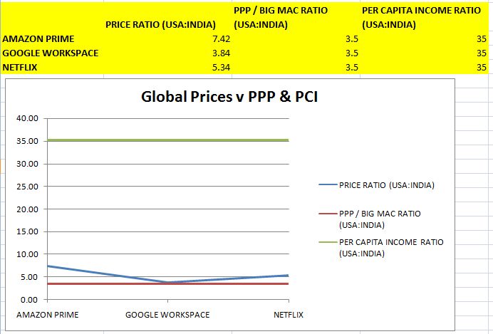
As you can see, in this chart, PPP and PCI are depicted as Lower Control Line and Upper Control Line respectively. I realized later that this representation is typically used when the variables change with time. That’s not the case in our situation where we’re capturing a snapshot of the prices of the three products at one point in time.
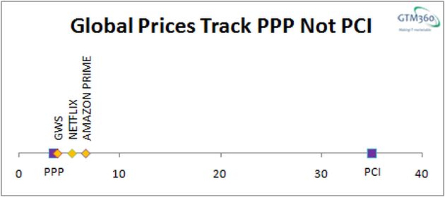
I felt that a number line – like the one shown in the exhibit on the right – would be a better way to convey that the three prices are closer to PPP than PCI, which is the crux of my argument.
While it’s very easy to draw a number line by hand, I found out that it’s not a standard chart type in Microsoft Excel. I then tried to figure out if it could be somehow plotted in Excel.
When I googled “Number Line in Excel”, I got only one result, which was on Stack Exchange.
While the article confirmed that it’s possible to plot a number line in Excel, the instructions given in it were very cryptic. It took me a while to decipher them and a lot of trial-and-error to actually plot the number line. The chart you see above is the result.
I thought I’ll describe the procedure in the form of a “moron-proof” step-by-step guide.
Welcome to Excel Number Line for Normies, the second guide in my “For Normies” series, which began with my book WordPress Migration For Normies.
EXCEL NUMBER LINE FOR NORMIES
Enter the Data
- Let’s start with a clean slate and enter the following data in cells A1…E2.

- Create a dummy Y-axis by entering zeroes in cells A3…E3.

Plot the Basic Chart
- Select cells A2…E3 > click Insert > Charts > Scatter > Click the first option.
- Select and delete the Series1 box in the resulting chart.
- Click the chart > click Layout > Axis > Primary Vertical Axis > None.
- Click the chart > click Layout > Gridlines > Primary Horizontal Gridlines > None.
- Click the top handle of the chart and pull it down to reduce the height of the chart.
- Click the chart > click Layout > Chart Title > Centered Overlay Title > Enter Number Line.
- (Optional) Click the chart > Click Layout > Axis > Primary Horizontal Axis > More Primary Horizontal Axis Options > Number > Decimal Places = 0.
Enter Data Labels
- Click the chart > Right click > Click Data > Series1 > Edit > Series Name > Click cell A1, Series X Values > Click cell A2, Series Y Values > Click cell A3. (At this point, you’ll find that four out of your five data points have vanished. Don’t worry, they will come back after you carry out the remaining steps in this section.)
- Click the chart > Right click > Click Data > Add > Series Name > Click cell B1, Series X Values > Click cell B2, Series Y Values > Click cell B3.
- Repeat above step thrice to define the remaining data labels in cells C1, D1, and E1 as Series Names.
- Click the first marker (MIN) in the chart > Click Layout > Data Labels > More Data Label Options > Label Contains > Uncheck Y-value > Check Series Name > Label Position = Above.
- Repeat the above step for the last marker (MAX).
- Click the second marker (LABEL1) in the chart > Click Layout > Data Labels > More Data Label Options > Label Contains > Uncheck Y-value > Check Series Name > Label Position = Above > Alignment > Text Direction > Click the third option – Rotate all text 270 degrees.
- Repeat the above step twice for the third (LABEL2) and fourth (LABEL3) markers in the chart.
Change Marker Shape & Size
I didn’t like the default marker shapes and sizes. They can be changed as follows:
- Click the first marker (MIN) in the chart > Right click > Format Data Series > Marker Options > Marker Type > Built-in > Choose the shape you want from the drop-down list > Change Size = 10.
- Repeat the above step for the last marker (MAX).
- Click the second marker (LABEL1) in the chart > Right click > Format Data Series > Marker Options > Marker Type > Built-in > Choose the shape you want from the drop-down list > Keep Size = 7 (default value).
- Repeat the above step twice for the third (LABEL2) and fourth (LABEL3) markers.
Change Marker Color
I didn’t like the default marker colors and the fact that they were different for each marker. Here’s how to fix that:
- Click the first marker (MIN) in the chart > Format > Shape Fill > Click the color you want from the palette.
- Repeat the above step for the last marker (MAX), with the same color.
- Repeat the above step three times for the three markers in between, but with a different color.
You should now see the following chart.
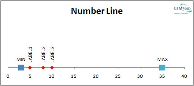
I selected settings such that the
- First and last data labels are displayed horizontally
- Labels in between are displayed vertically
- First and last markers have the same shape, size and color.
- Markers in between have a different shape, size and color.
You can tweak the settings to change the appearance of data labels and markers to suit your preference.
We hope you find the Excel Number Line for Normies step-by-step guide useful.
Bottomline:
Don’t ever say there’s no way to do something in Excel.
– Jon Peltier via Stack Exchange