A Porsche costs $120,000 in USA, which is twice the nation’s Per Capita Income of $60,000. For $3,400, which is 2X of India’s Per Capita Income of $1,700, you won’t even get a Maruti 800. The same model of Porsche would cost ₹1.25 crores ($156K) in India, which is 92X the Per Capita Income of India.
2X in USA versus 92X in India.
This does not mean that Porsche AG is fleecing Indians.
It means that per capita income is not the correct yardstick for comparing the price of an item across different countries.
But many people do, including veteran business correspondents.
@ProsaicView: Maybe you should look at per capita income as well as well as PPP to get a clearer idea.
This tweet was in response to the following rate card for medical procedures posted by Dr. Vijay Pahwa @Helth_z_Wealth on Twitter.

As you can see, there’s a vast difference in the price of a medical procedure across different countries e.g. $144,000 in USA versus $5,200 in India for a heart bypass surgery.
I’m not surprised by this. In fact, it’s one of the main factors that made me summarize my personal experience of healthcare in different countries in Health Insurance, Not Price Control, Is The Solution in the following manner:
- Germany: Pay Lot Get Lot
- UK: Pay Little Pray Lot
- USA: Pay Nothing Get Nothing, Pay Lot Get Lot
- India: Pay Nothing Get Something, Pay Lot Get Lot
However, cynics complain that prices in India are way too high in relation to Per Capita Income of India versus USA.
They’re right about the math but terribly wrong about the principle of multicountry pricing.
As I explained above, their expectation of prices to be comparable with per capita income is ludicrous in the context of Porsche. If somebody were to counter that by saying that Porsche is a wrong example because it’s a luxury product with a limited market in India, let me give some more examples of products that have a largish market in India:
- Google Workspace
- Netflix
- Amazon Prime
Given below is a comparison of their prices in USA and India.
| ITEM | LCY | USD:LCY | PRICE IN LCY | PRICE IN USD | PRICE RATIO USA:INDIA |
|---|---|---|---|---|---|
| GOOGLE WORKSPACE (GWS) | |||||
| India | INR | 80 | 125 | 1.56 | 3.84 |
| USA | USD | 1 | 6 | 6.00 | |
| NETFLIX | |||||
| India | INR | 80 | 149 | 1.86 | 5.34 |
| USA | USD | 1 | 9.95 | 9.95 | |
| AMAZON PRIME | |||||
| India | INR | 80 | 179 | 2.24 | 6.70 |
| USA | USD | 1 | 14.99 | 14.99 | |
All prices are per user per month for the entry level plan, sourced from the respective company’s website. (#FunFact: The Google Workspace price list page is geofenced and I’d to use a VPN to get the price for USA.)

WHY GEOFENCE PRICING?
Just imagine how much revenue Alphabet Inc. would lose if Goldman Sachs Bombay office ordered Google Workspace subscriptions at the Indian price for the whole of Goldman Sachs USA.
As you can see, the ratio of USA:India price ranges from 3.84 (Google Workspace) to 6.70 (Amazon Prime). These are nowhere near the ratio of USA:India Per Capita Income of 35 (being $60000/$1700).
As in the case of Porsche, this does not mean that Google, Netflix and Amazon are looting Indians.
What it does mean is that price of a product across multiple markets does not track Per Capita Income.
What does it track, then?
Per Investopedia,
Purchasing Power Parity is a theoretical exchange rate that allows you to buy the same amount of goods and services in every country.
According to the following chart, PPP for India is 22.458.
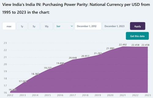
The USD:INR exchange rate is 80. Because of lower cost of living in India, 80 rupees has a greater purchasing power in India than one dollar in USA. The equivalent purchasing power is expressed as PPP i.e. 22.458 ~ 22.50. Therefore, 22.50 INR has the equivalent purchasing power in India as 1 USD does in USA.
Big Mac Index is a pop culture proxy for PPP. It’s the price of a McDonald’s Big Mac burger in USA divided by its price in a given country. Big Mac Index of India is 3.5, being USD:INR Exchange Rate of 80 divided by PPP of 22.458.
Let’s tabulate the price ratio of the above products versus PPP and PCI ratio.
| PPP | GWS | NETFLIX | AMAZON PRIME | PCI |
|---|---|---|---|---|
| 3.5 | 3.84 | 5.34 | 6.70 | 35 |
When we plot these values on a number line, we get the following chart:
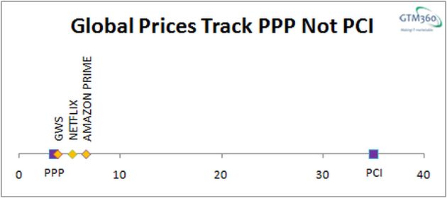
As you can see
- The prices of all three products are clustered around PPP
- None of these products is priced anywhere close to per capita income ratio of 35.
This tells us that multicountry prices track PPP.
This should be obvious because it is to compare prices across countries that economists basically devised the concept of PPP. But, for some reason, even otherwise knowledgeable people seem to believe that multicountry prices ought to track Per Capita Incomes, so I had to jump through the above hoops to prove the basic point of economics.
Twitter Blue: Yet another product whose global pricing tracks PPP (not PCI). https://t.co/waMi0e8pKG
— Ketharaman Swaminathan (@s_ketharaman) November 2, 2022
Some people overstretch the PPP logic.
@hiteshkgupta: My friend working in San Diego earns $270K but he believes his counterparts in Bangalore earning INR 55-60L are leading much better lifestyle.
If we multiply $270,000 by 22.50 (being PPP as stated above), we get ₹60.75 lakhs.

So, the ₹60 lakhs figure is a valid estimation of the purchasing power in India of $270K in USA.
But this narrative misses the following points:
 PPP / Big Mac Index is applicable only for everyday consumer goods and not to capital goods like housing or mortgage interest rates (which are way lower in USA than India).
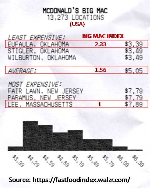
- Cost of living varies more widely between different cities in USA than India. According to Riley Walz, a Big Mac costs $7.89 in Lee, Massachusetts (costliest) versus $3.39 in Eufaula, Oklahoma (cheapest). Accordingly, there are places within USA itself with a Big Mac Index of 2.33 (being $7.89/$3.39). Restaurants are not subject to MRP in India but I still doubt if we’d find such a wide variance in the price of a Big Mac across any two cities in India.
- With the same lifestyle, the guy in USA will accumulate way more wealth than the guy in India since 3.5 times Income less 3.5 times Expense still yields 3.5 times Savings.
@s_ketharaman: When there’s so much variance in price of Big Mac across different US cities, any idea which US city is taken as baseline in calculating Big Mac Index of different countries: Most Expensive, Least Expensive or Average?
Another way of looking at the aforementioned Porsche price comparison is that
This doesn’t mean Porsche is fleecing Indians. It just means that Porsche is not affordable in India.
Since price in relation to income is a measure of affordability, some people might argue that they don’t expect a luxury product like Porsche – or even discretionary products like Google Workspace, Netflix and Amazon Prime – to not track Per Capita Income but implore that basic necessities like healthcare should be equally affordable to everyone everywhere. By saying so, they’re implicitly making the case for prices for medical procedures to track PCI (rather than PPP).
In principle, healthcare is as much an industry as automobile or software or video streaming, so there’s no reason why it should follow the different yardstick of PCI compared to the other industries, which track PPP.
If price of a given thing varies across nations, it's by PPP. Not by Per Capita Income because, in that case, everything will be equally affordable to everyone. Which sounds noble but it's a bad thing since it takes away the motivation for people to produce more and earn more.
— Ketharaman Swaminathan (@s_ketharaman) July 24, 2022
However, in practice, an interesting pattern emerges when we compare prices of medical procedures across nations.
| ITEM | LCY | USD:LCY | PRICE IN LCY | PRICE IN USD | PRICE RATIO USA:INDIA |
|---|---|---|---|---|---|
| RHINOPLASTY | |||||
| India | INR | 80 | 4000 | 2.00 | |
| USA | USD | 1 | 8000 | ||
| KNEE REPLACEMENT | |||||
| India | INR | 80 | 6200 | 8.06 | |
| USA | USD | 1 | 50000 | ||
| HEART BYPASS | |||||
| India | INR | 80 | 5200 | 27.69 | |
| USA | USD | 1 | 144000 | ||
The ratios are shown below:
| PPP | RHINOPLASTY | KNEE REPLACEMENT | HEART BYPASS | PCI |
|---|---|---|---|---|
| 3.5 | 2 | 8.06 | 27.69 | 35 |
Here’s the above data, plotted as a number line.

As we can see, the Indian price of
- A life-saving procedure like Heart Bypass is closer to PCI than PPP.
- A cosmetic procedure like Rhinoplasty is even higher than the PPP-determined price.
- Knee replacement, which comes in between life saving and cosmetic procedure, is quite close to PPP.
This suggests that the Indian healthcare industry is subsidizing life-saving procedures with cosmetic ones in order to make the former more affordable than their PPP-adjusted prices.
Hope this satisfies the aforementioned cynics.
PS: The above graphs are number lines. It’s not a standard chart type in Microsoft Excel. In another post, I’ll publish a step-by-step guide on how to plot a number line in Excel. Watch this space!