In Three Ways To Lie With Charts, we saw the following tactics:
- Slippery Slope Slide
- Floating Origin Fraud
- Dual Axis Deception
The most common reason for people to lie with charts is that they are shilling some product, service or ideology and run into facts that derail their pitch, so they need to lie to continue with their pursuit.
But, after reading my previous post, some kind-hearted souls among you argued that lying is not the only motivation for people to create / spread misleading charts.
I took that objection seriously and did a deep dive of the other likely reasons.
This blog post is the result.
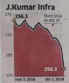 Slippery Slope Slide
Maybe the label of the stock price (256.3) on the last day was a typo. But, with novel ways of lying with charts coming up every day, what do I know?
Floating Origin Fraud
This could be a problem caused by default settings in Excel.
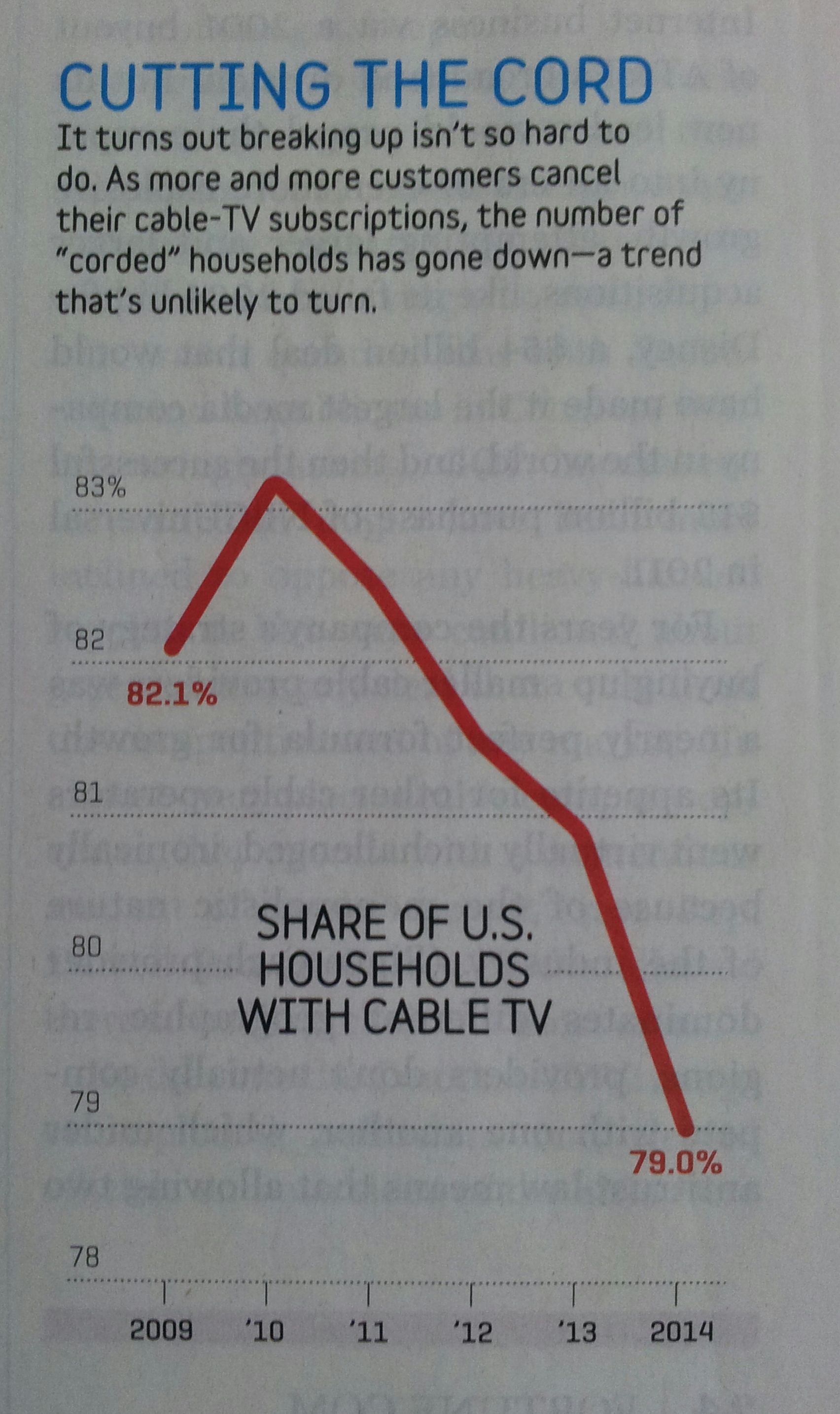 Back in the day, the Y-axis of a line chart on Excel would begin at zero by default. Whereas in recent versions, I’m noticing that the Y-axis begins, by default, near the smallest value of the dataset on that axis. While the change in default setting has resulted in a chart that makes better use of white space, the appearance of the chart drastically comprises the integrity of the data. For that reason, it’s wrong.
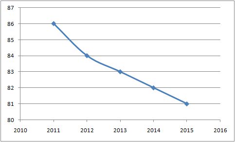
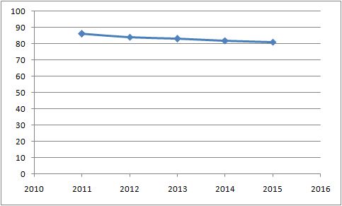
Let me illustrate this problem by using this Excel spreadsheet, in which the data on the Y-axis ranges from 81 to 86.
| 2011 | 86 |
| 2012 | 84 |
| 2013 | 83 |
| 2014 | 82 |
| 2015 | 81 |
I used the following default chart settings in the ‘Default Chart’ tab: Select both columns; Insert > Scatter Chart > 2nd Option > Default chart settings.
As you can see, the Y-axis on this chart begins at 80, which is just one unit lower than 81, the lowest value on the Y-axis data series; and the chart that results is misleading (Exhibit 1).
To fix this, I changed the settings in ‘Modified Chart’ tab as follows: Select both columns; Insert > Scatter Chart > 2nd Option > Change chart settings > Layout > Primary Vertical Axis > Primary Vertical Axis More Options > Change Minimum Value from Auto to 0; Change Maximum Value from Auto to 100.
Now, the Y-axis begins at 0, as it should, and the chart conveys the correct picture (Exhibit 2).
Dual Axis Deception
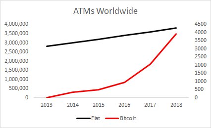 I thought this chart was an outright attempt to mislead readers. But, then I found that Excel was the culprit again.
I don’t know how to change the default settings to prevent this dual-axis chart from being misleading and couldn’t be bothered to learn.
Since I can’t “beat ’em”, I decided to “join ’em”.
Here’s a misleading contribution of my own that stokes my hypothesis that Fintechs Shouldn’t Stop Drinking The Disruption Kool-Aid despite their – ahem – humble accomplishments on disruption in actual practice (Exhibit 3).
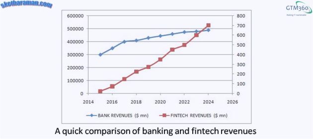
Ha ha:)
Typo. Using default settings blindly. Reluctance to learn a tool correctly.
These are the reasons for the aforementioned misleading charts (assuming that lying is not).
The common factor behind them is laziness or casual attitude aka sloth.
Lying or sloth? Take your pick.
At least lying is not one of the seven deadly sins.