Lying with charts is the natural progression from Lying With Big Data and Pixie Dust Sampling – Or How To Commit Harakiri By Lying With Big Data.

I have come across the three ways of doing that.
#1. SLIPPERY SLOPE SLIDE
There are charts that gyrate up and down for no apparent reason other than that they were probably caught in a slippery slope.
Here’s an example of such a chart (Exhibit 1).
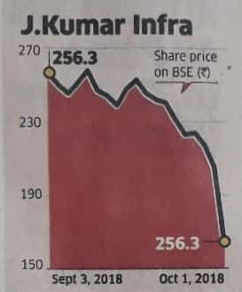
Although the price of the company’s share was INR 256.3 on both the first and the last day of the period covered by the chart, the chart somehow takes a nosedive.
Likely the handiwork of some pump-and-dump operator?
#2. FLOATING ORIGIN FRAUD
Darrell Huff showed how statisticians mislead people by changing the origin of charts in his 1954 classic How To Lie With Statistics.
Although the book is nearly 60 years old, this tactic is widely used even today – well after the jargon has changed from statisticians to data scientists.
Fortune recently published the following chart (Exhibit 2) on “cord cutting”, the relatively new trend of people disconnecting their cable connections and getting their TV content from streaming sites like Netflix, Amazon Prime, Disney / Hotstar, et al.
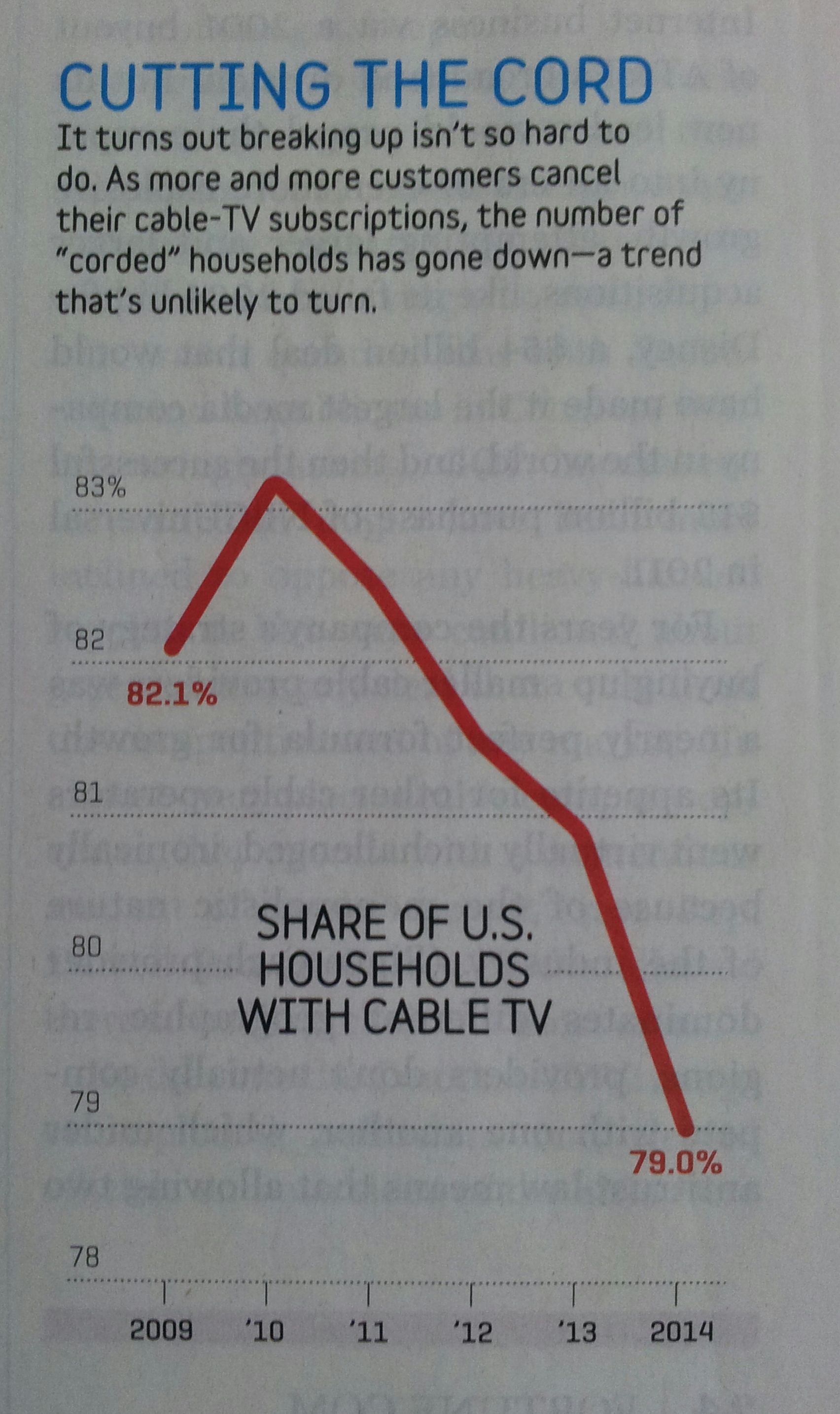
Anyone taking a quick glance at this chart would see the curve taking a nosedive and totally believe the article’s claim that cord cutting is killing cable TV.
However, this is far from the truth. The chart conveys the article’s misleading claim by shifting the origin of the vertical axis from 0% to 78%.
If we shift the Y-axis origin to 0%, which is where it belongs, we get a different picture (Exhibit 3):
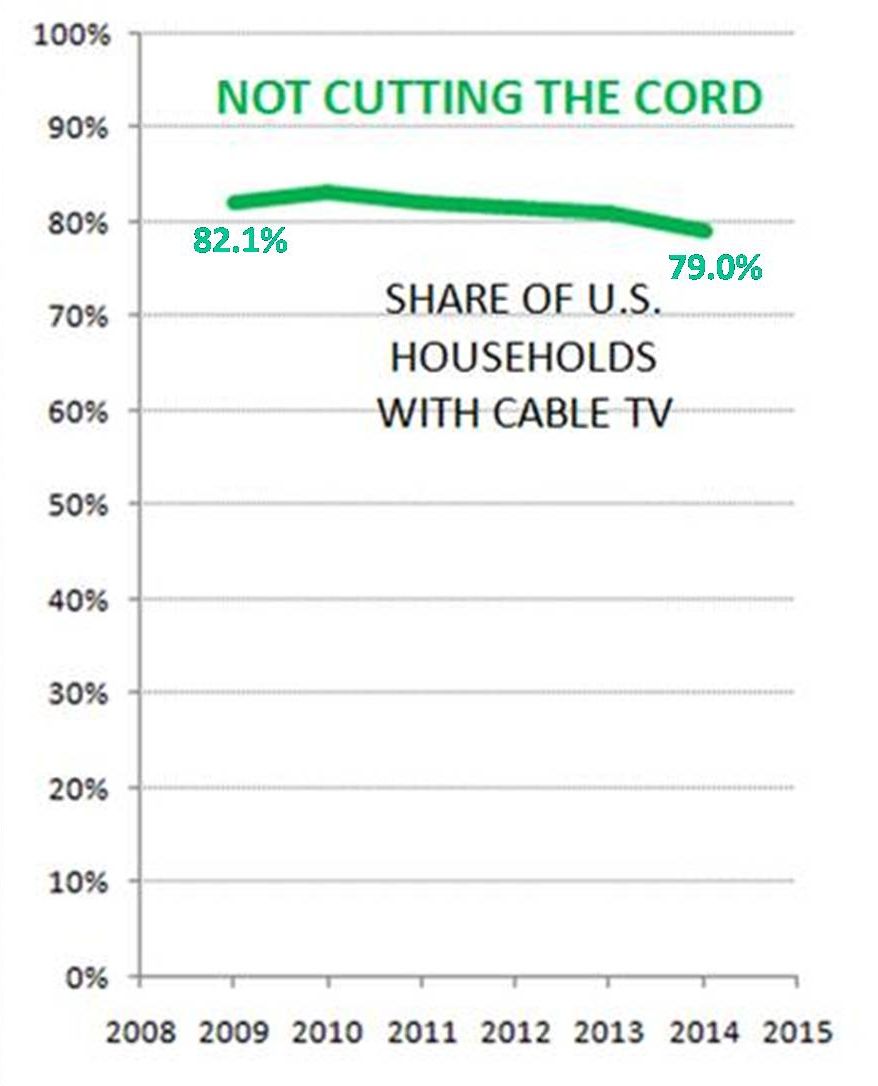
Visually, the impact of of cord cutting on cable TV appears small.
For the quants among you, 82.1% of US households had cable TV five years ago. 79% of them still did so in 2014. The drop in cable TV penetration is 3.1 percentage points over five years i.e. CAGR of -0.77% p.a. That’s not life-threatening by any stretch of imagination.
Let’s place the two charts side-by-side (Exhibit 4).
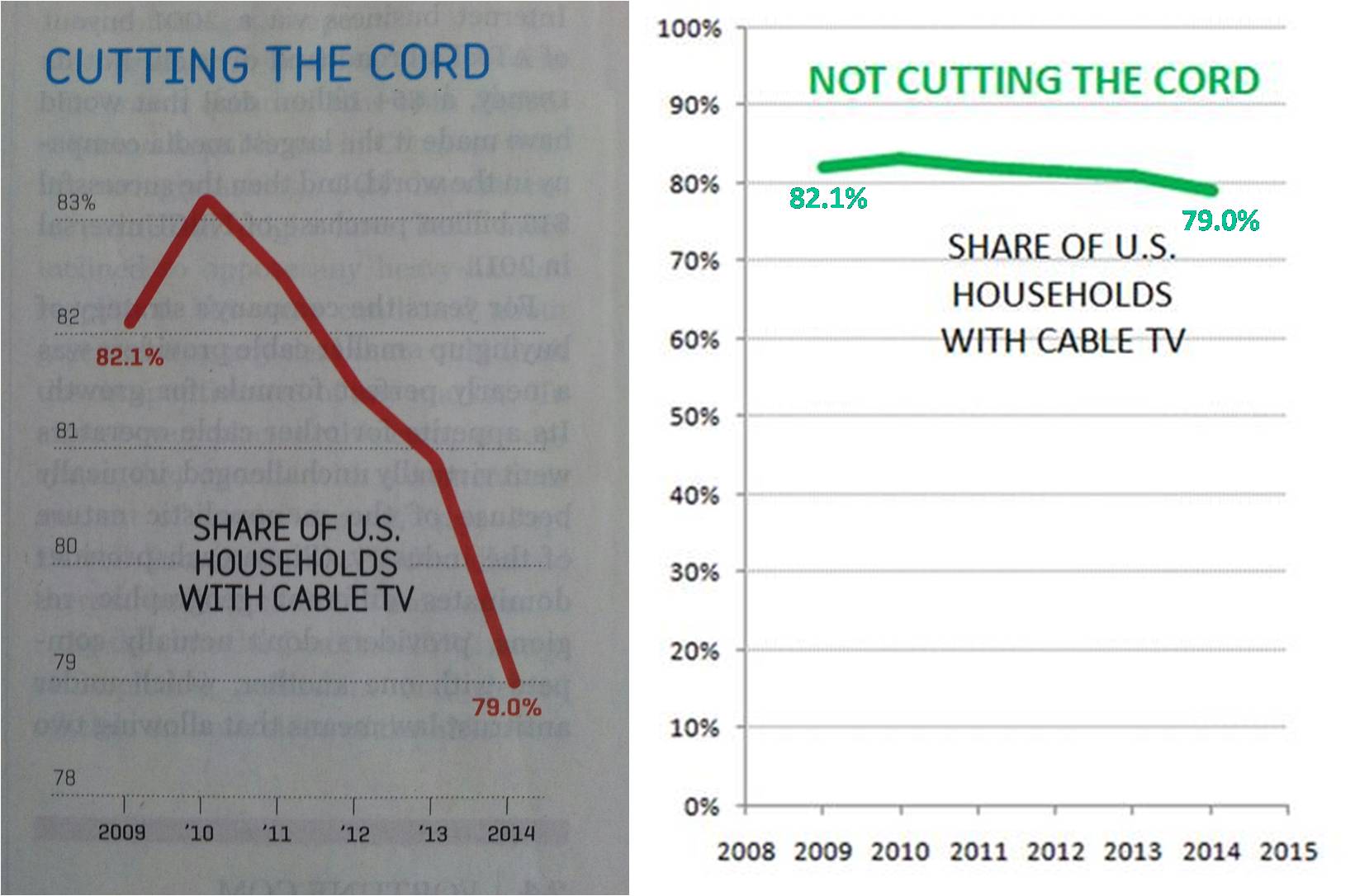
Now you get the real picture and can appreciate just how much misleading was done by the original chart in the article.
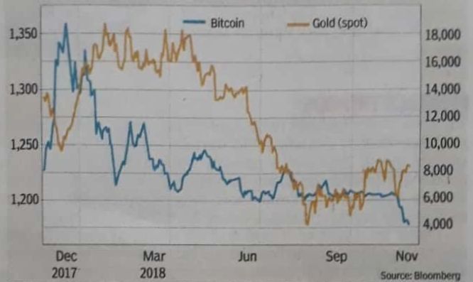
#3. DUAL AXIS DECEPTION
This is a relatively new tactic.
I saw the first example of it in this tweet, in which a cryptoenthusiast makes the following “quick comparison of Bitcoin and Fiat ATMs” (Exhibit 5).
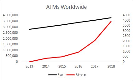
To a casual observer, it would appear that the number of Bitcoin ATMs would exceed the number of Fiat Currency ATMs by ~2019.
Obviously, that’s not true.
The chart misleads readers by using drastically different scales for the vertical axis on the LHS (Fiat ATM Count) versus the RHS (Bitcoin ATM Count).
Here’s another example of this deception in the following chart comparing the value of Bitcoin versus Gold on Bloomberg (Exhibit 6).
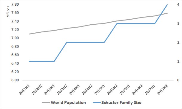
Thankfully, these charts get lampooned on social media repeatedly. Here’s a ROTFL spoof by @Edmund_Schuster (Exhibit 7):
These are just the three ways of lying with charts that I’ve come across personally*.
I’m sure there are more. If you know any, please share in the comments.
The kind-hearted souls among you might argue that lying is not necessarily the culprit for the misleading charts displayed above.
I won’t disagree with them because I can myself think of at least one non lying-related reason. But it’s arguably worse than lying.
More on that in a follow-on post (Spoiler Alert: It’s one of the seven deadly sins).
* Please see comments below for a few more ways of lying with charts.