Let’s take the following two statements:
- Indians are obsessed over security
- Indians make payments without entering any password.
Each of these statements is a fact. But, taken together, they appear contradictory and portray Indian consumers as fickle (or worse).
Not true.
In this blog post, I’ll use the principles of Customer Journey Mapping to explain why these statements are not contradictory.
Before that, let me amplify the two aforementioned statements.
Indians are obsessed over security
All over the world, people expect their payment apps to be secure but Indians are obsessed about security. For some reason, there’s a huge misconception that fraud originated in India. While I disagree with that opinion, I’m in the minority. As a result of the majority opinion, Indians demand utmost security in everything.
Result: Ultra paranoid security measures that can’t be found in any other trillion-dollar economy e.g:
- Two factor authentication for online credit card payments
- For months after the introduction of PIN, offline credit card payments required signature in addition “just to be on the safe side”
- Electronically delivered documents (e.g. ebills, digital security note for online stock transactions, etc.) will be sent only to registered email address. Although users need a password to access their inbox, the electronic document (typically in PDF format) will have its own passphrase. After that, the PDF will itself have a digital signature. Then all the PII like address, card number, etc. will be redacted.
- No burner phones. Even prepaid mobile phone connections are subject to full KYC.
Needless to say, the security obsession of Indians extends to mobile wallets in which they store their money.
Indians make payments without entering any password
PayTM is the largest mobile wallet in India. With over 300 million users, it’s gunning to become the largest mobile payment in the world (by user count, not transaction volume or value). Should you wish to know how PayTM raced ahead of its competitors, I strongly recommend this blog post entitled Five Reasons Why PayTM Is Miles Ahead Of Its Competition, even if I say so myself:).
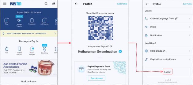
The logout button of PayTM is buried deep inside the app – it requires five scrolls to reach it.

As a result, many PayTM users haven’t seen this button and remain logged into the app at all times. This means they can make payments without entering any password. And 99% of them do, going by my personal observation.
As we’ll see shortly, this creates a huge security vulnerability in PayTM.
Still hundreds of millions of security-obsessed Indians make prolific use of PayTM.
PayTM Vital Stats:
* 5 billion Transactions
* $50 billion Gross Transaction Value
* 8 million Merchants, 3X of card networks' coverage
* 50% user base in Tier-II & III cities
* 75% English, 25% Regional Language. https://t.co/g4one5Qz0I via @Paytm— GTM360 (@GTM360) September 29, 2018
What gives?
Users want security, but only until they get it.
When they are made to jump through hoops in the name of enhanced security, many users get stuck, confused, frustrated and quit.
Put more formally, the apparent paradox is because of how customer journey works.
For the purpose of this post, Customer Journey can be defined as the path taken by customers while interacting with a company / brand. A customer journey
- traverses multiple stages in a customer’s relationship with a brand viz. awareness, interest, desire, action, repeat purchase and advocacy AND
- encompasses a variety of physical and digital touchpoints like store, telephone, website, mobile, and other channels.
 Closely related to Customer Journey is the concept of Customer Experience, which is the overall experience felt by the consumer while they go through the Customer Journey.
In the specific context of a mobile payment app, let’s say you’ve installed a mobile wallet and use it regularly, say, 3-5 times a day. In customer journey parlance, you’re at the “repeat purchase” stage.
Question: If you have to enter a 8 character password that is a combination of letters, number and special characters (say Pa$sw0rd123) into a mobile wallet five times a day, will you look forward to using the app?
I thought so, too.
The takeaway from this is that you’ll use an app on a regular basis only if it’s frictionless. Per contra, you’ll avoid an app that makes you jump through too many hoops. This means that you value convenience at the end of the customer journey.
Now let’s go back to “awareness”, the stage at the start of the customer journey.
Question: If you hear that a mobile wallet is not secure, will you touch it with a 40 feet bargepole?
Again, I thought so, too.
![]() But PayTM is one such app. Notwithstanding all the song and dance that PayTM makes about Norton Secured, PCI-DSS, and the other acronyms splashed all over its app, an app that lets you make a payment without entering a PIN or password is not secure.
But PayTM is one such app. Notwithstanding all the song and dance that PayTM makes about Norton Secured, PCI-DSS, and the other acronyms splashed all over its app, an app that lets you make a payment without entering a PIN or password is not secure.
I’m not the only one.
For one, India’s banking-cum-payments regulator RBI mandates that all payment apps must ask for a PIN or password for each payment.
For another, PayTM has itself complained to the regulator that WhatsApp Pay – the messaging app’s payment service that’s being piloted among 1 millions users in India – allows a payment to be made without entering a password.
Hypocritical of @Paytm to complain that WhatsApp Payments doesn't have a login. Its own Sign Out link is buried so deeply that 99% of PayTM users I know are permanently logged into the app and never enter password / PIN to make an individual payment.https://t.co/hBaOIqVk4h
— S.Ketharaman (@s_ketharaman) February 19, 2018
Notwithstanding all that, nearly 300 million people (and counting) use PayTM.
This is because a user is in the “awareness” stage only once but they’re in the “repeat purchase” stage countless times. Therefore, it’s logical that convenience, the attribute that’s important in the repeat purchase stage, should play a more important role than security, the attribute that’s important in the awareness stage. PayTM gets this logic.
Before using an app, security looms large. But once people regularly start using a mobile wallet, their expectation from the app becomes nuanced. This introduces the following challenge in security design:
Payment Security Design Challenge
Payor wants her payment service provider (PSP) to let her access her money easily. At the same time, she obviously does not want it to allow anyone else to access her money, no matter how hard they try. The catch is that, per se, the PSP doesn’t know who is trying to access the money. It can only find that out by taking some action to distinguish between her and that anyone else. Designing that action without causing too much friction presents a unique challenge in payments.
In a generic context, as @alidabbs puts it:
Where @alidabbs expresses the security design challenge in just two lines:
"Security is essential, of course, but only for other people. Not me. I'm the nice guy here and this sodding keypad is stopping me from getting in."
~ https://t.co/Rf111TBaON via @TheRegister
— GTM360 (@GTM360) June 10, 2019
Or, as this Visa exec expresses it more formally,
Well said: “One of the toughest challenges in payments is separating good transactions made by account holders from bad ones attempted by fraudsters – WITHOUT ADDING FRICTION TO THE PROCESS.” ~ Melissa McSherry, SVP & Global Head of Data, Risk & Identity Products & Solns, Visa.
— Ketharaman Swaminathan (@s_ketharaman) June 25, 2019
By not asking for a password for each payment, PayTM fulfills the payor’s first wish of letting her access her money easily.
Maybe PayTM will find a way to fulfill the second wish one day. But, today, it does not prevent others from accessing the payor’s money. If a fraudster lays his hands on your smartphone, he can transfer your wallet balance to himself instantly. Besides, if you’ve kept a debit card on file, the fraudster can drain your entire bank balance since PayTM stores the CVV and the mobile phone to which PayTM will send the OTP to fulfill two factor authentication is in the hands of the fraudster.
Leaning on lockscreen password is lame: Lockscreen is the gateway to your phone. You phone has many apps that don’t require a password. Whether you want to have a lockscreen password or not is entirely your decision. PayTM and other payment apps have no right to rely on your lockscreen password to prevent unauthorized use of your funds inside their apps.
PayTM’s app design reflects a keen understanding that convenience is more important to continued usage of an app, no matter how heavily consumers obsess over security before they download and start using a payment app.
PayTM’s approach is not unique. All of us regularly book a cab, order food delivery and check email on our phones without entering a password. But it is testimony that this consumer behavior trait is equally applicable to a sensitive usage scenario like payments.
Moral of Story: Consumers are driven by different considerations at different stages of the customer journey. But all considerations are not created equal.
UPDATE DATED 18 OCTOBER 2023
RBI introduced 2FA for online payments, saying it improves security and gives greater comfort feeling for people to make online payments. When Uber brazenly bypassed it for the sake of convenience, RBI rapped Uber on the knuckles and said “Security is more important than convenience”.
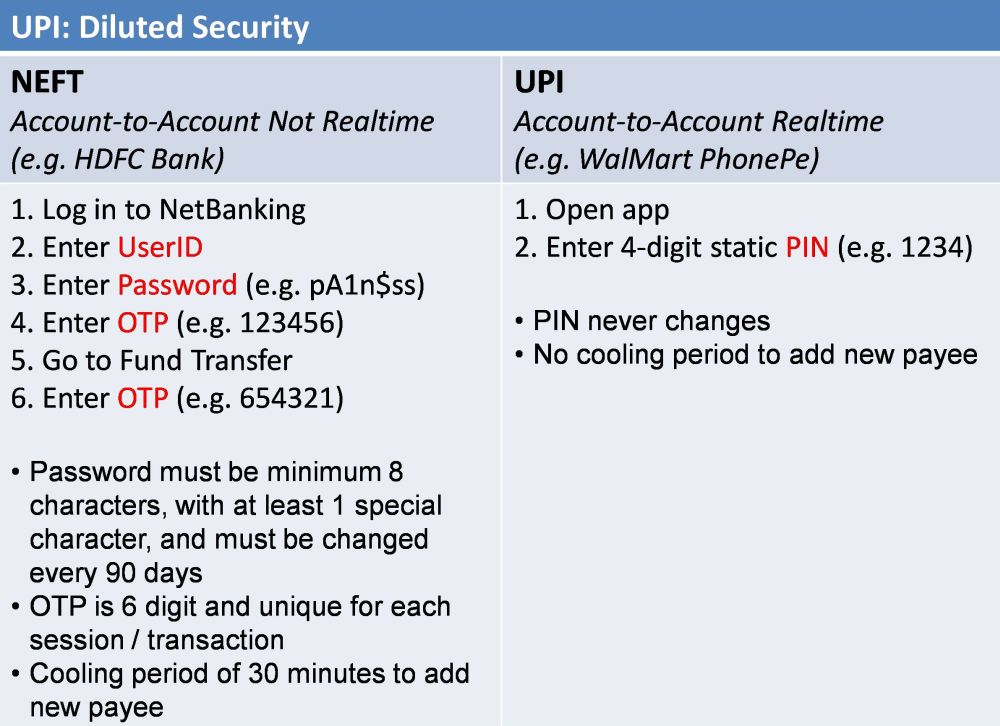
RBI also stipulated all kinds of security measures for accessing online banking, which is a gateway to make NEFT and IMPS payments. These included login password, OTP, change password every 90 days, etc. This posed too much friction. As a result, uptake of digital payments was lacklustre.
As we’ve seen in the original post, PayTM shadily subvented 2FA, got away with it, and gained massive traction.
Over time, PayTM became too big to be shut down for subventing the 2FA mandate. The company also showed that fraud levels didn’t spike as a result of its lax security.
Perhaps realizing that the sky didn’t fall due to PayTM’s innovative design, RBI drastically diluted security for UPI compared to Netbanking / NEFT / IMPS.
UPI adoption took off.
Rest is history.
