 A few years ago, images on websites and banner ads used to suck. Poor resolution, bleeding colors – these were the common problems in images used even by leading brands.
That’s mostly history now. Image quality has improved significantly in recent times.
I wish I could say the same about image sizes and aspect ratios.
I wrote “Preserve Aspect Ratios And Protect Corporate Identities!” six years ago. I didn’t expect to change the world with this one post but, just as image quality has improved with time, I thought awareness of getting aspect ratios right would’ve increased during the same period.
Alas, that has not happened. I still come across distorted images regularly on websites, digital ads, emails, flyers, signs and many other digital media properties. Given below are a few recent examples.
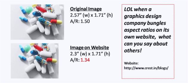
#1. CREST
I was a bit disheartened to note that a graphics design company bungled the aspect ratios of images on its own website!
My tweet to the company higlighting the problem went unanswered. I don’t know what was the root cause of the image distortion issue.
#2. STARTUP MASTER CLASS
“Engineers do it with precision”.
This double-entendre was emblazoned on the IIT Bombay T-Shirt during my undergrad days at the institute.
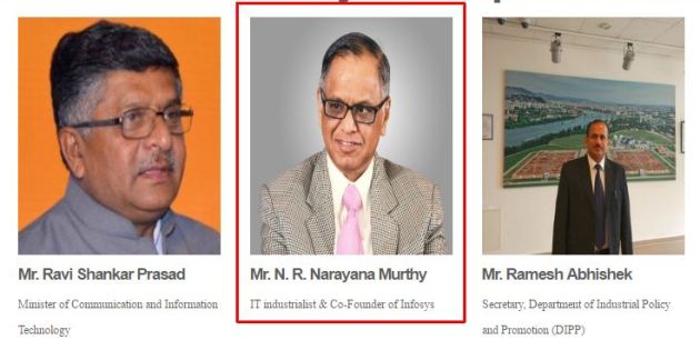
Thirty years after I was graduated from IIT Bombay, one look at the website of Startup Master Class made me wonder if precision is confined only to t-shirts! The Pan-IIT event held in the first week of this month had mauled the mugshots of its keynote speakers, as you can see in the following exhibit.
This is what Chrome’s Inspect command showed.
If you look closely, the aspect ratios of the native and website images are reciprocals of each other (0.85 = 1/1.17). This suggests that the designer / programmer of the website had wrongly substituted length for breadth while resizing the images, which is what probably caused the distortion of the images. This reflects a casual attitude.
A few hours after I sent the above tweet, the event organizer fixed the issue. The pictures of the keynote speakers looked perfect.
Kudos to @iitkaa_smc for taking my feedback in the right spirit – IITians always tend to do that in my experience – and taking prompt corrective action.
#3. FINEXTRA
It’s not just Indian brands. The daily email newsletter of Finextra, the leading UK-based newswire and information source for the fintech community, carries a incorrectly sized logo of SAP.
@Finextra Logo of SAP in your daily email is distorted. Attached image describes problem & provides solution. pic.twitter.com/fbIgz1mabP
— Ketharaman Swaminathan (@s_ketharaman) September 2, 2016
I’m hopeful that Finextra will fix this issue in the coming days.
I’m saying this based on my experience with the British program manager of a leading consulting firm. This guy’s slide deck had several typos. The next day, he and I were going to present it to the steering committee of a Top 5 UK bank. I couldn’t keep quiet and pointed out a couple of typos. He raised his eyebrows and mumbled “What has the world come to when an Indian has to correct an Englishman’s spelling”. But he took my feedback sportingly and immediately fixed all the typos.
I’m hoping that Finextra will do the same (Update: Indeed it has!). After all, my “graphical suggestion” is language-agnostic and my nationality shouldn’t matter.
Aspect ratio is not rocket size. Designers / programmers can preserve it by using the “tiling” or “cropping” techniques described in my previous post.


