 If you can recognize the person without clicking the image on the right, you can stop reading this post right now.
However, like most of us with normal eyesight, if you’re able to recognize that it’s Aishwarya Rai only after clicking on the image, welcome to the world of distorted images on the world wide web.
While this is an extreme example of distortion, let’s see a few relatively common examples.
If you look at the picture on the left, you’d surely recognize the companies behind the respective logos, but you’d also realize that something is not quite right here. Just as you wouldn’t like people (mis)spelling your name variously as JJackk, Jaccck, Jackk, despite everyone knowing that they’re referring to Jack, companies wouldn’t like people taking liberties with their corporate identities, of which logos are a vital component.
 The same way, I can bet that Lee Child won’t be pleased to see how an online library displays the jacket cover of one of his books. But let me not single out this website. If you search Google Images for logos of leading companies and jacket covers of popular books, you’d find no end to distorted versions.
This is because programmers – and, sometimes, even graphics designers – don’t pay attention to “aspect ratio” of images. Defined as the ratio of height to width, aspect ratio is as intrinsic to an image as its shape and color. As the above logos and jacket covers indicate, the wrong aspect ratio distorts an image and mars its identity.
In spite of the importance of aspect ratios, they aren’t preserved very often either out of ignorance of the concept or a casual attitude while handling images. This explains why we see so many distorted images on the Internet.
While there could be several reasons for this, let me quote a couple along with suggestions on how to lick this problem.
People tend to resize an image simply by grabbing its corners and dragging them in whichever direction they wish to increase / decrease its size. In this process, the height and width of the image change disproportionately as compared to the original image’s attributes, thus resulting in the loss of the image’s aspect ratio. To avoid this, click the Shift key while dragging the corners of an object – this way, the program ensures that the aspect ratio is preserved. Alternatively, for those using the resize commands in various programs, ensure to select the option that’s typically called “Lock aspect ratio” or “Preserve aspect ratio” depending upon the specific program, as shown in the following picture.
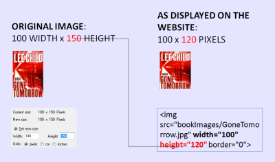
Sometimes, the way in which HTML code is written is also to blame. In order to reduce download times of images, programmers are encouraged to specify the height and width of an image that they’re calling within their HTML code. Given a fixed space in which to display each image from a set of multiple pictures, many programmers specify a fixed height and width within their HTML code. Now, since different images have different sizes, forcibly displaying them within a uniform height and width window leads to altering their aspect ratios. This is the culprit behind the distortion of the jacket cover of the aforementioned Lee Child book, as the following code extract from this website shows.
While the original image’s width (100 pixels) is preserved in the so-called image tag within the HTML code, you’ll notice that its height has been forcibly changed to 120 pixels from its correct value of 150 pixels, which has led to the observed distortion.
 In such situations, the trick is to embed original images of differing sizes into larger rectangles of uniform dimensions, so that their aspect ratios are preserved. I don’t know if there’s a technical term for this but I call this “tiling”. The website of US Auto Parts is a good example of getting this right.
Sometimes, the original image has a gradient background. Tiling does not work well in these cases. You need to “crop” the original image to preserve its aspect ratio. I call this technique “cropping”.
Let me conclude by exhorting all programmers and graphics designers to use tiling or cropping to preserve aspect ratios and protect corporate identities!


