![]() In Art Meets Science With A/B Testing – Part 1, we’d introduced the new crop of cloud-based providers of A/B testing solutions.
In Art Meets Science With A/B Testing – Part 1, we’d introduced the new crop of cloud-based providers of A/B testing solutions.
To do a quick recap, Optimizely, Unbounce and other providers of such solutions do all the heavy duty lifting on the cloud, freeing up website designers to focus on the business side of optimizing their web pages. Designers don’t need to do any programming. By adding one line of code to their websites, they trigger the A/B testing and leave it to the service providers to handle the rest. Some providers like Optimizely provide many popular metrics out-of-the-box viz. engagement (i.e. percentage of visitors who clicked any part of the experiment page) and signup (i.e. percentage of visitors who triggered Sign Up).

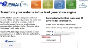
We were recently curious to find out if there was any scope for improvement in the text and color of the CTA (call to action) element on the homepage of our EMAIL360 website. As the screenshot on the right shows, the original page had the somewhat geeky “Get this widget!” text inside a somewhat staid gray-color button. This probably echoed the flawed assumption of the original design team that EMAIL360 would be used by programmers who knew what widget meant and didn’t bother about aesthetics. However, we had no intention of restricting EMAIL360 to the geek squad. In fact, it has more value for small and medium businesses who lack much IT support. Therefore, we started wondering if changing the text to something less technical (e.g. “Sign up!”) and the color to something more attractive (orange / blue) would make a significant difference to conversion i.e. percentage of visitors who actually entered their details and clicked this button to collect the widget code. Since there was no definitive answer to this subjective question, we decided to carry out an A/B test.
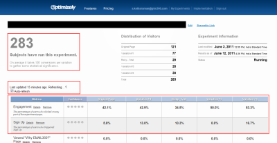
Put off by Wingify / Visual Website Optimizer, who was the first vendor we contacted, we used Optimizely for our A/B test. Our test was conducted on the original page and four variants of button text and color i.e. five versions in total. To illustrate, variant 4 matched the original page’s text (“Get this widget!”) but sported a more attractive blue color.

As promised by Optimizely on its website, we didn’t have to do any programming while specifying the different versions of the page. We used five metrics, including the most key one, namely, sign-up. We ran the experiment for around two weeks, which was the time it took for the results to reach statistical significance.

On the engagement metric (i.e. percentage of visitors who clicked any part of the experiment page), all five versions performed fairly similarly. Whereas, when we looked at the key signup metric (i.e. percentage of visitors who clicked the “Get this widget!” button), we found a significant difference between the five versions. Our original page had a paltry 5.8% conversion whereas Variant 4 delivered more than 3X conversion at 16.7%.
The writing was the wall. Thanks to Optimizely, we acquired a strong scientific basis on which to take the following decisions:
- Don’t change the button text
- Change the button color
We implemented the above change to the homepage of EMAIL360 and have since seen a sharp uplift in customer acquisition.
It’s worth noting at this point that the incremental customers we acquired subsequent to our A/B testing came from absolutely no increase in website traffic. In other words, A/B testing fits into the CONVERT – rather than ATTRACT – stage of inbound marketing and logically forms a part of our suite of Conversion Rate Optimization solutions.
We’d like to take this opportunity to laud Optimizely for its excellent understanding of our situation and prompt support at all crucial times of the experiment. The next time we intend doing A/B testing for ourselves or our customers, we won’t look anywhere else. For the value Optimizely delivers, its price is hardly a pocket-pincher. For vendors like Wingify / Visual Website Optimizer who bungle on the very first base and seem to lack any go to market theme other than low cost, our experience should serve as an eye-opener: Genuine customers will always pay for value and will shun valueless products even if they’re given away for free.
